Clarity
Make the recipient, value, funding source, state, and consequence of an action understandable at the moment of decision.
CASE STUDY / 01
A selection of shipped financial-product work at PayPay, combining hands-on design and team leadership across an interconnected wallet.
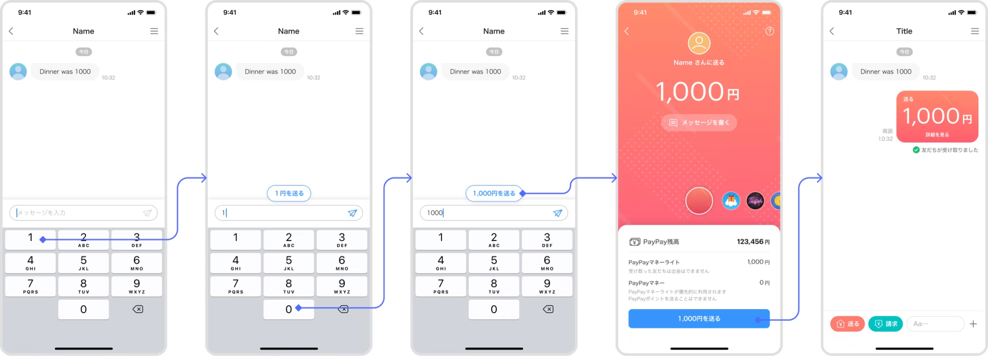
After P2P Chat launched, new users sometimes typed a number into the message field expecting it to be an amount input. The interface exposed a mismatch between the product model and users’ expectations.
View detail — ProblemMake sending money more discoverable without turning arbitrary chat input into a financial action or removing confirmation.
View detail — ExplorationRecognise a numeric entry and offer an explicit ‘Send ¥X’ shortcut, then route people through the existing review and payment flow instead of converting text directly into a transaction.
View detail — SolutionThe source analytics snapshot shows shortcut taps rising from November to December 2022. This supports adoption, but does not establish that the shortcut caused overall transaction growth.
View detail — Validation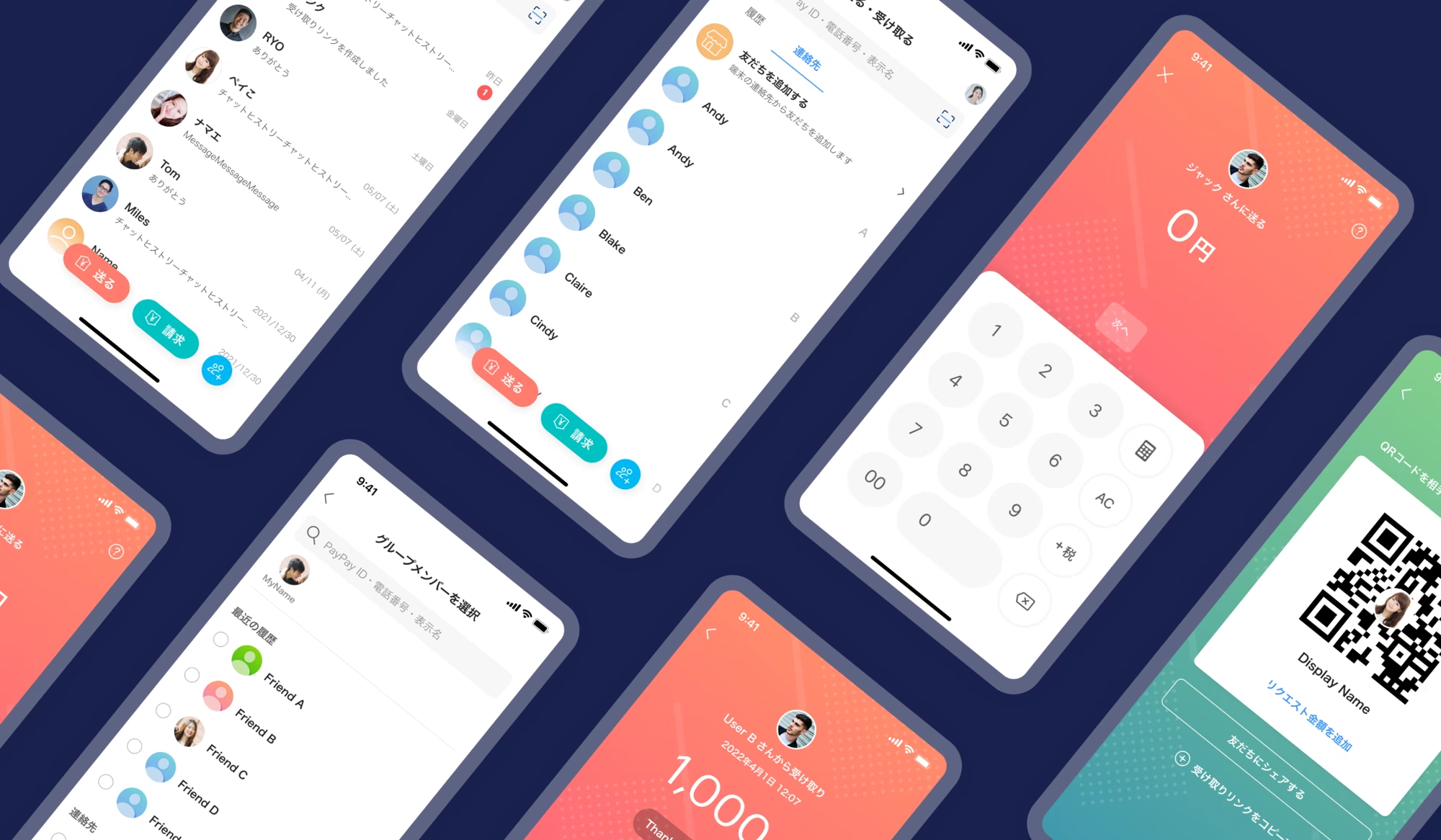
01 — Context
PayPay was expanding from everyday payments into a broader wallet spanning peer-to-peer transfers, points, balances, and personal financial activity. Each area had its own goals and delivery constraints, but customers experienced them as one product.
02 — Problem framing
Make the recipient, value, funding source, state, and consequence of an action understandable at the moment of decision.
Treat confirmation, reversibility, error prevention, and transaction status as core product behaviour—not edge-case polish.
Use a shared interaction and visual language across transfers, activity, points, and the wider wallet.
03 — Design reasoning
I used one reasoning path to turn feature requirements into complete financial experiences.
Start with what changes for the customer: who receives value, which balance changes, and what must remain visible after the action.
Map entry, selection, review, confirmation, receipt, notification, history, and recovery instead of treating the feature screen as the whole product.
Balance speed against reassurance and information density against comprehension, then document why the chosen hierarchy is safe enough for everyday use.
Review copy, components, exception states, accessibility, and engineering constraints so the final experience works as part of the wallet—not as an isolated flow.
What must the customer understand before, while, and after money moves?
04 — Shipped problem solving
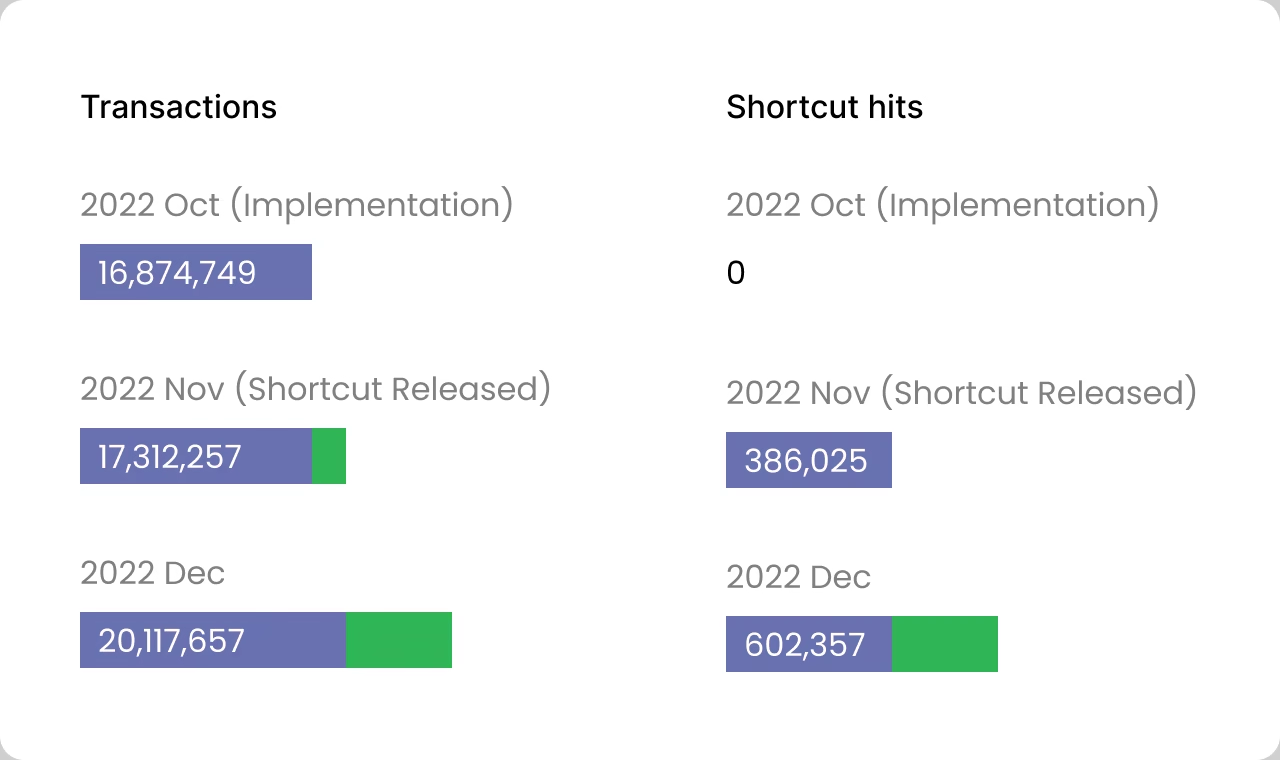
Source: product analytics snapshot reproduced in Zeke’s original portfolio, Oct–Dec 2022. Counts are shown as reported and do not by themselves establish causality.
PFM shipped, but its section in the source portfolio still contains draft placeholders and a duplicated cover. Detailed imagery is intentionally omitted until reliable source screens are added.
05 — Transaction design
The interaction was never only ‘enter an amount and tap send.’ The design had to keep people oriented as risk increased, money moved, and the system resolved.
Keep the entry point and recipient relationship visible.
Make the value and funding source explicit before commitment.
Prioritise the information that can prevent an expensive mistake.
Distinguish completed, pending, rejected, cancelled, and expired states.
Reconnect receipt, notification, history, and recovery to the same transaction.
A simplified model of the shipped P2P journey, redrawn for portfolio clarity. The work shown in the source portfolio was publicly released.
06 — Ecosystem view
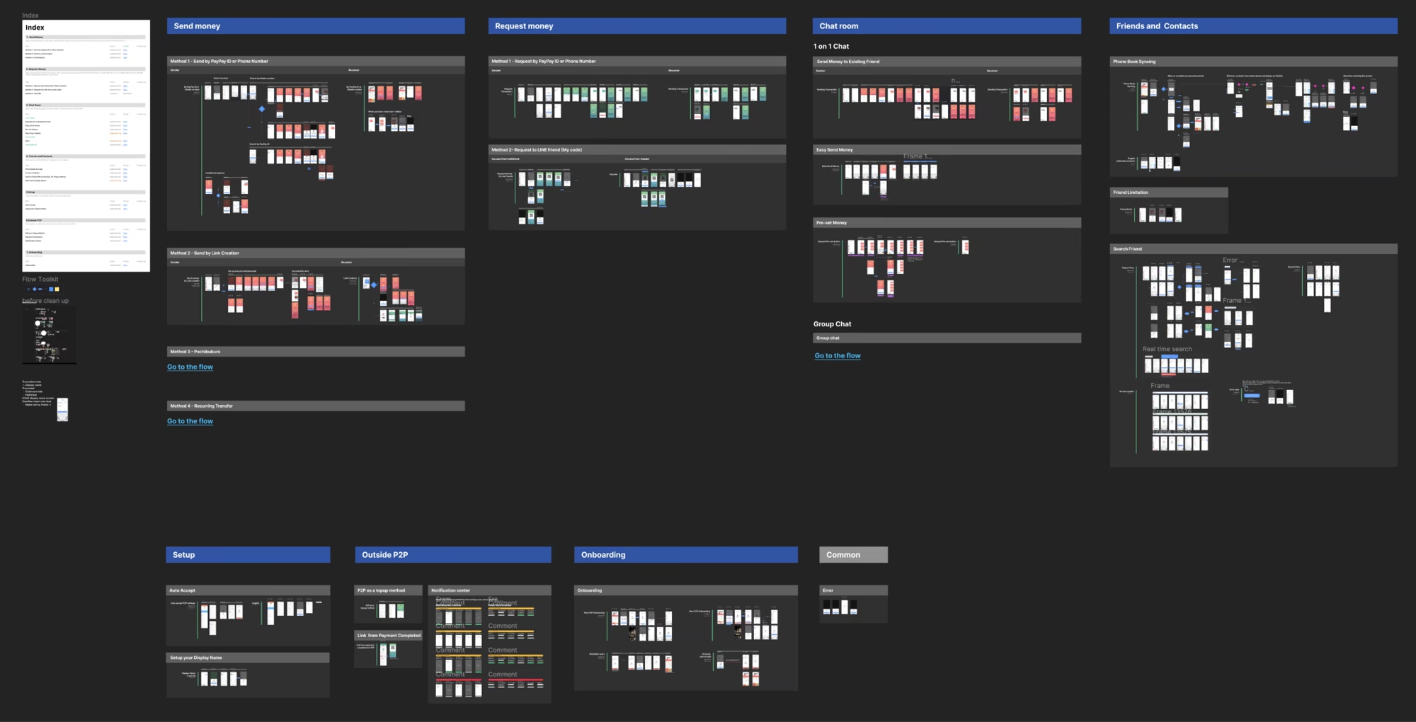
P2P Chat, Easy Send, PFM, points, notifications, and transaction history shared the same underlying questions about identity, value, status, and trust. Making those dependencies visible before implementation was both a product-design and design-management responsibility.
07 — Design leadership
Clarify the problem with product partners, connect feature work to the complete wallet, and give each designer a decision frame rather than a prescribed screen.
Review hierarchy, financial language, interaction logic, edge cases, accessibility, and implementation feasibility—not visual finish alone.
Maintain visibility across parallel initiatives, run critique, and coach designers to explain and defend decisions independently.
08 — Product & team impact
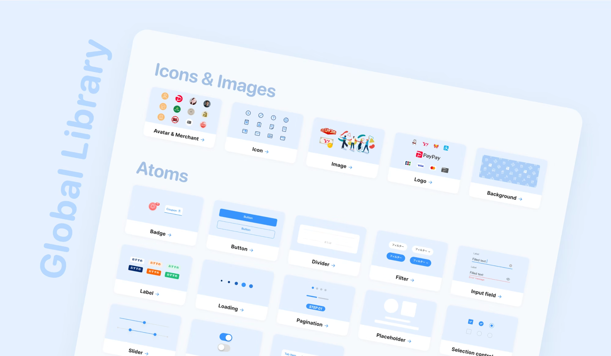
P2P Chat, Easy Send, PFM, and the design-system work represented in the source portfolio all reached production.
Easy Send addressed a documented comprehension problem by turning numeric chat input into an explicit shortcut while preserving review before payment.
The original analytics snapshot records transactions rising from 16,874,749 in Oct 2022 to 20,117,657 in Dec, and shortcut taps from 386,025 in Nov to 602,357 in Dec.
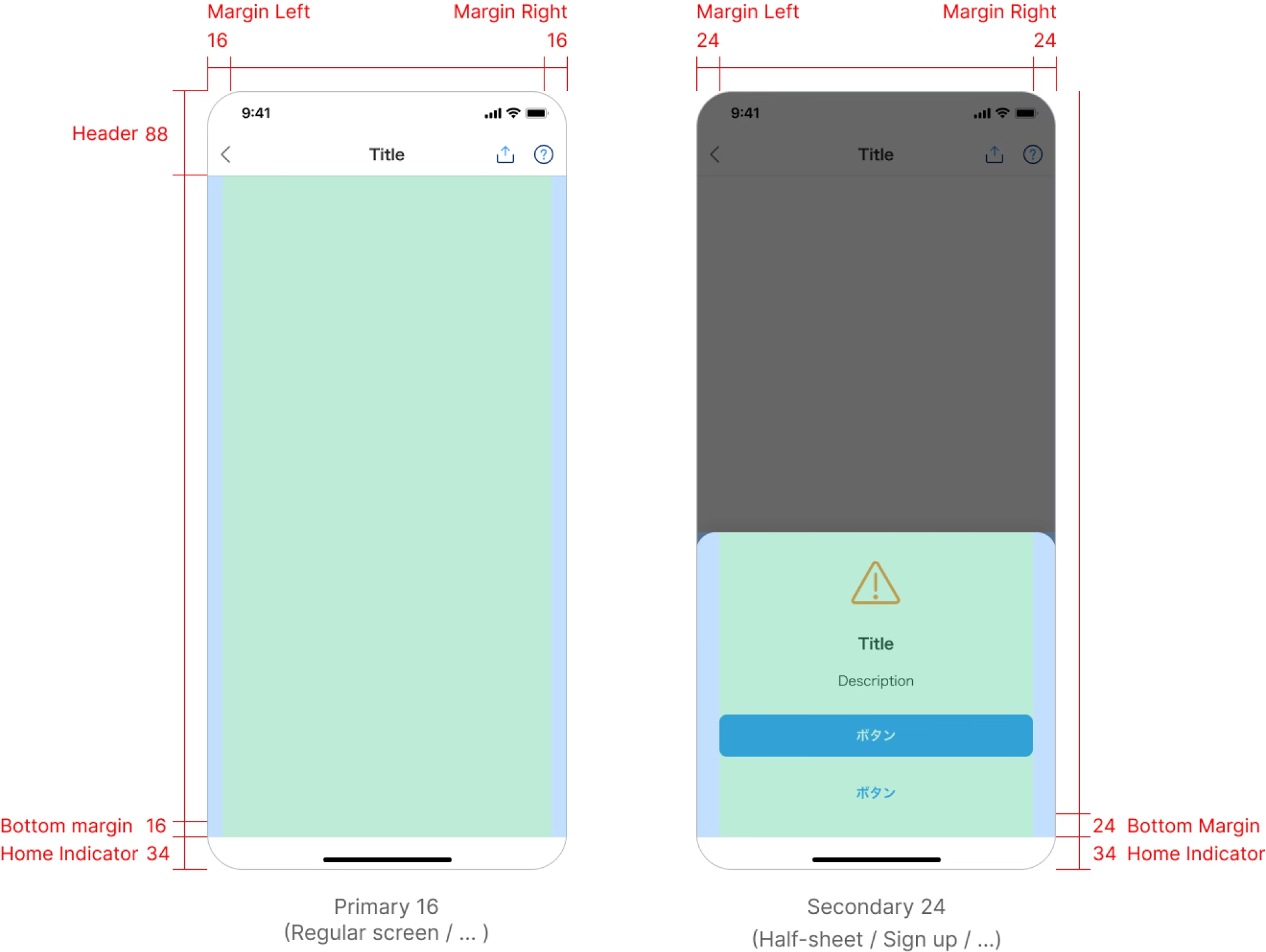
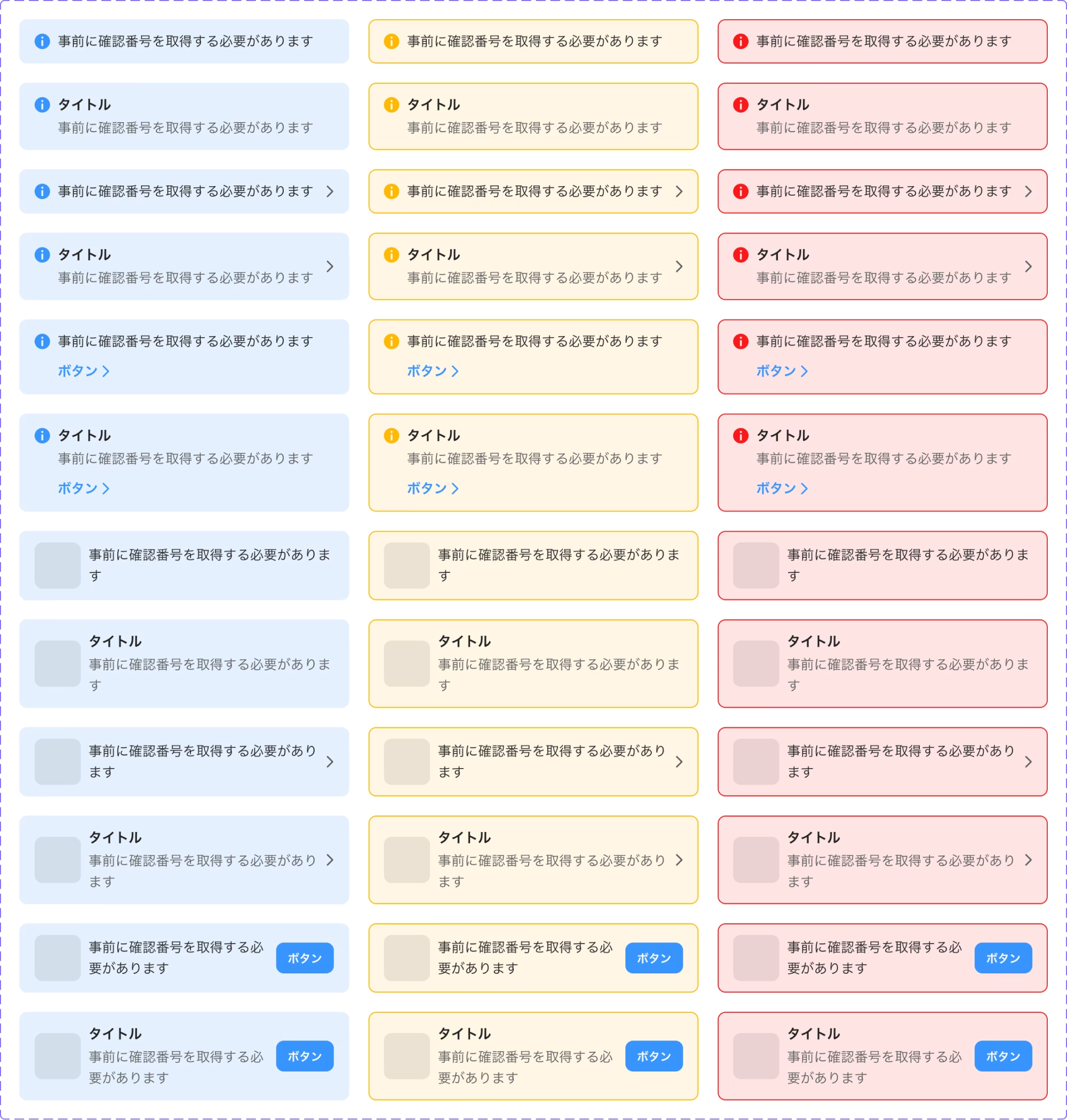
Shared foundations gave designers and engineers a more consistent starting point for recurring interface decisions.
Release status and public availability were confirmed by Zeke. Quantitative values are reproduced from the Easy Send product-analytics snapshot in the original portfolio (Oct–Dec 2022); they are descriptive, not a claim that the shortcut alone caused the change. PayPay and related trademarks remain the property of their respective rights holders.
Official product — PayPay on the App Store09 — Reflection
The strongest design leadership was not approving more screens. It was helping the team frame the consequence, expose the trade-off, and carry a decision through every state of the product. That made problem solving visible at both interface and organisational scale.